One of the training modules I teach is called Introduction to Camtasia Studio. This introductory module is geared towards university Faculty and Staff with no prior screen capturing or video editing experience. Because the individuals participating in the course have little or no prior experience with this medium, I would say that the material covered can be a bit challenging and therefor would classify the intrinsic load of this module to be of a medium level.

While I have worked to chunk the content of the module into manageable units, the one spot where people routinely get hung up is with envisioning the process of creating a screen capture from start to finish. This is a major difficulty during the session because people are distracted by the extraneous load of wondering how this screen capture they just created becomes a YouTube video. By creating a process diagram that illustrates the steps involved in going from start to finish I am hoping to increase the student's germane load by providing them with a scaffold for envisioning the production process. This graphic would be presented at the beginning of the session as a session road map and then referred to as we progress from one section to the next. Again, the graphic was designed around a sequence of content that is chunked in accordance with cognitive load theory (Ch. 3) in an effort to provide the learner with an optimal learning load (low extraneous load and high germane load).

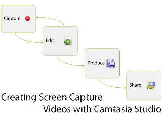
I chose rectangles to enclose my content areas and arrows to show the flow from one step to the next (Ch. 10). The rectangles each contain one of the module's four main topics and the topic's accompanying icon. These icons are reused throughout the module for repetition; through reuse these icons function as a working memory rehearsal technique as well as a long term memory cue for the learner (Ch. 3). Each rectangle is connected to the next with an arrow that depicts the flow of the process. The capture and edit rectangles are depicted as part of a cycle because people may need to perform these actions several times before they are ready to move on to the Produce step of the process. Lastly, I arranged my rectangles and title text in a downward staircase pattern because I wanted to imply that the content flows from one part of the process to the next (Ch. 10).

This graphic went through several iterations. To view previous versions and my partners comments please either scroll down or click here:
Thank you for the feedback; this was extremely helpful!!

In this iteration of the graphic I made several changes based on your comments. The icons are all the icons used in Camtasia with the example of the share icon. Unfortunately, there is no sharing icon in the software so I used an icon that is familiar on our campus. I also use this icon during the class so it should be highly recognizable. The icon for the Capture box was from the Camtasia splash screen and the text said "New Screen Recording." I agree with your assessment that the text was distracting as it could not be read. I changed this icon for the recording icon used in other places in the software. Next, I increased the overall size of the font. Like you, I found the text hard to read once I uploaded it to the blog. I think the increase helps with this issue. I also moved the title to accommodate the larger text size. Since I had to break the title across two line I decided to integrate an element of repetition by having the text mimic the shape of the graphic. Finally, I increased the overall size of the graphic (click to see the full size version).

Thank you again! Please let me know if you have any additional thoughts!


One of the training modules I teach is called Introduction to Camtasia Studio. This introductory module is geared towards university Faculty and Staff with no prior screen capturing or video editing experience. Because the individuals participating in the course have little or no prior experience with this medium, I would say that the material covered can be a bit challenging and therefor would classify the intrinsic load of this module to be of a medium level. While I have worked to chunk the content of the module into manageable units, the one spot where people routinely get hung up is with envisioning the process from start to finish. This is a major difficulty during the session because people are distracted by the extraneous load of wondering how this screen capture they just created becomes a YouTube video. By creating a process diagram that illustrates the steps involved in going from start to finish I am hoping to increase the student's germane load by providing them with a scaffold for envisioning the production process. This graphic would be presented at the beginning of the session as a session road map and then referred to as we progress from one section to the next.

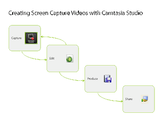
I chose rectangles to enclose my content areas and arrows to show the flow from one step to the next. The rectangles each contain one of the module's four main topics and the topic's accompanying icon (the icons are reused throughout the module for repetition and assistance in recall). Each rectangle is connected to the next with an arrow that depicts the flow of the process. The capture and edit rectangles are depicted as part of a cycle because people may need to perform these actions several times before they are ready to move on to the Produce step of the process. Lastly, I arranged my rectangles in a downward staircase pattern because I wanted to imply that the content flows from one part of the process to the next.


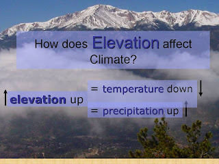
I would estimate that this visual is used for an introductory earth science course at the middle school (6-9th grade) level. While this visual has the foundational basis to be a solid learning tool, the designers appear to have lost interest about halfway through the Diamond Design process (p 89). Spending more time in the ACE process, especially the Evaluate phase of the ACE process, would have been beneficial to this designer as this slide could use improvement in the three Evaluation areas: Effectiveness, Efficiency, and Appeal (p 74). First, the graphic has failed to achieve its goal of effectiveness as the decorative visual (p 6), that was probably an attempt to make the image learner-friendly (p 31), is distracting and this distraction detracts from the slides effectiveness. This decorative visual and text combination is an example of a selection issue (p 81) where the designer has not given due attention to the contrast between the image and the text. This issue might be addressed through the use of a solid colored text box (only one!) and the use of a high contrast color text. The efficacy is also lacking in this image. There is little organization on the slide and I found the poor proximity and alignment of many of the elements in the image to be confusing and distracting (CARP p 80). Proper alignment of the objects with one another through the use of baselines would assist the learner in understanding what information is intended to be associated. Flow and association between objects would also be improved by tightening up the proximity of related objects such as the arrows with their associated texts as currently the arrows are floating in space. Lastly, the appeal of this slide is low due to the above cited issues as well as the use of multiple (poorly) overlapping text boxes. A confusing slide is does not "convince learners that they will understand it" (p 87). To the contrary, a confusing slide de-motivates a learner. A redesign of this slide might look something like the image posted here:


Hi Everyone! My name is Jes. I am an instructional technologist at Worcester Polytechnic Institute in my home town of Worcester, MA. In my job I support mostly faculty members in the design, development, and delivery of technology-based solutions for the purpose of (hopefully) enhancing teaching and learning. I am still relatively new at my job, having been in this field for less than two years, but I love it!

While I now consider myself amongst the ranks of the IT professionals, I used to be a biologist (both my B.S. and M.S. is in biology). I have had many people ask if this was a difficult transition for me, and my answer is always the same: no, pursuing your passions should never be a chore!

In my personal life I am a gardener, mom to three cats, yoga practitioner, and avid book reader. I live in Worcester, Ma (the second largest city in New England) with my fiancée.

Lastly, in case anyone was wondering, I look nothing like my drawing! This is the real me :)


Back to Home Back to Top Multimedia Learning. Theme ligneous by pure-essence.net. Bloggerized by Chica Blogger.