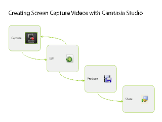
One of the training modules I teach is called Introduction to Camtasia Studio. This introductory module is geared towards university Faculty and Staff with no prior screen capturing or video editing experience. Because the individuals participating in the course have little or no prior experience with this medium, I would say that the material covered can be a bit challenging and therefor would classify the intrinsic load of this module to be of a medium level. While I have worked to chunk the content of the module into manageable units, the one spot where people routinely get hung up is with envisioning the process from start to finish. This is a major difficulty during the session because people are distracted by the extraneous load of wondering how this screen capture they just created becomes a YouTube video. By creating a process diagram that illustrates the steps involved in going from start to finish I am hoping to increase the student's germane load by providing them with a scaffold for envisioning the production process. This graphic would be presented at the beginning of the session as a session road map and then referred to as we progress from one section to the next.
I chose rectangles to enclose my content areas and arrows to show the flow from one step to the next. The rectangles each contain one of the module's four main topics and the topic's accompanying icon (the icons are reused throughout the module for repetition and assistance in recall). Each rectangle is connected to the next with an arrow that depicts the flow of the process. The capture and edit rectangles are depicted as part of a cycle because people may need to perform these actions several times before they are ready to move on to the Produce step of the process. Lastly, I arranged my rectangles in a downward staircase pattern because I wanted to imply that the content flows from one part of the process to the next.


1 comments:
Hey Jes,
Great image! When I looked at it I could easily follow the process of creating a screen capture video with Camtasia. The arrows you used helped me to follow the sequential steps taken to complete the video. I really liked how you had the arrows on the capture and edit rectangles as a cyclical process. To me this was very easy to understand that it was something that might need to be repeated before the producer could move on to the next step in the process. I understood this before reading your justification (GREAT DESIGN!). I also like how the process is in the shape of steps. This makes it clear which comes first next and then last. The rectangles chunk the information nicely and help to reduce the intrinsic load on the learner.
There were a few things that I found that you might want to consider changing. Even when looking at your image in its largest size I had a hard time reading the text. I thought it was because I wasn’t wearing my glasses, so I went and put them on... I still think it is too small and could be larger, maybe at the bottom across the whole width of the rectangle. The image could then be placed on top of the words or if you prefer the words on top image below. This would allow the text to be larger and therefore easier to read. The second thing I was a bit confused about was the image you chose for the “capture” box. There are words in it that I can’t make out. Do these words mean something? If not maybe crop the image so that it is just of the computer screen. The other images I am assuming are the icons used in Camtasia. Let me know if I am wrong. If they are not, you might want to consider using the icons that the users of Camtasia would normally see. I think they are as you are a smart person and would have probably already thought about this :)
Other than that I love your image and think you did a great job!
Let me know if you have any questions about my comments.
Thanks
Shannon
Leave a Comment