Thank you for the feedback; this was extremely helpful!!
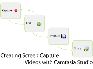
In this iteration of the graphic I made several changes based on your comments. The icons are all the icons used in Camtasia with the example of the share icon. Unfortunately, there is no sharing icon in the software so I used an icon that is familiar on our campus. I also use this icon during the class so it should be highly recognizable. The icon for the Capture box was from the Camtasia splash screen and the text said "New Screen Recording." I agree with your assessment that the text was distracting as it could not be read. I changed this icon for the recording icon used in other places in the software. Next, I increased the overall size of the font. Like you, I found the text hard to read once I uploaded it to the blog. I think the increase helps with this issue. I also moved the title to accommodate the larger text size. Since I had to break the title across two line I decided to integrate an element of repetition by having the text mimic the shape of the graphic. Finally, I increased the overall size of the graphic (click to see the full size version).
Thank you again! Please let me know if you have any additional thoughts!


1 comments:
Hey Jes,
I love what you have done! I think the using of the icons in Camtasia minus the share icon will make using the program more familiar for your students. The larger font is much better. I can totally read it even without my glasses! I like that you made the title match the downward step design it makes the whole image very unified in shape! I also like that you made it larger as this also helps to facilitate its readability.
Great job!
I think you got a winner here!
Shannon
Leave a Comment