 Based on comments provided by my partner I have modified the positions of the snails to place them all in the same plane relative to the ground. Placing all the snails in front of the ground enhances the feeling that the snail is moving forward along the ground. It also limits issues with figure ground that may have resulted from the previous orientation of the snails. It was also suggested that a bit of bevel be added to the last snail which is a suggestion that I like a lot, however due to the way my figure was drawn the addition of a bevel in Illustrator does not appear to be possible.
Color and Depth - Unit 4 Take 2
Posted in EdTech506, unit 4, Usability on byBased on comments provided by my partner I have modified the positions of the snails to place them all in the same plane relative to the ground. Placing all the snails in front of the ground enhances the feeling that the snail is moving forward along the ground. It also limits issues with figure ground that may have resulted from the previous orientation of the snails. It was also suggested that a bit of bevel be added to the last snail which is a suggestion that I like a lot, however due to the way my figure was drawn the addition of a bevel in Illustrator does not appear to be possible.Color and Depth - Unit 4 Take 1
Posted in EdTech506, unit 4, Usability on by
There are several graphical tools at the disposal of the Instructional Designer to aid in capturing or maintaining the attention of the learner. Tools such as color, depth, and space can all aid in the design of an effective visual (p. 265). For this unit I choose to explore these tools using a basic image of a snail. I was not targeting a particular grade level for this exercise rather I chose to explore the tools in a basic manner that is content and grade level independent. Please click on the image for a larger more detailed version.
Starting from the base of a simple shape (p. 254) I created the outline of a snail. From there I explored the use of texture (p. 272), full color (Ch. 11), and depth or dimension (p. 270). Each of these tools had a different effect on my perception of the snail image. The addition of a colored texture to the snail shell called my attention to the shell and also lent it a more three dimensional feel. The texture helped the shell to not appear as flat as it does in the other drawings where only color is used. The use of full color on the third snail helped to draw my attention to the snail, however, as is mentioned in the text book color in this situation was not required, it served no purpose other than to call the viewers attention to the image and aide in selection (p. 266 and 267). Lastly, drop shadow was used to give the snail dimension and the appearance of three dimensionality (p. 272). The addition of the drop shadow give the snail the feeling of depth as well as orientation.
Figure-ground, appropriate use of white space, and scale also factored into the creation of this image. The snails were designed to not result in optical illusion or other confusing visual effects thereby avoiding a figure ground conflict (p. 107 and 108). White space was also used in this figure as well as scale. By using a large heading text and a relatively small amount of white space above the snails a sense of scale is conveyed to the viewer (p. 272). I used both of these tactics to convey the smallness of the snails. themselves.
The color scheme chosen for this diagram was inspired by nature (p. 269). As the subject of this diagram was snails I felt that a nature/spring theme was very appropriate for the visual.
Expressive Words - Unit 3 Final Take
Posted in EdTech506, Final, Unit 3, Usability on by
Text in and of itself can express a great deal about the meaning of a word (p. 213). For this unit I choose to design a series of words that express their meaning. As I feel that there is a certain level of universality to word meanings, I was not targeting a particular grade level. I believe that these words might be at an appropriate level for students in elementary school and beyond (please click on image for larger version).
These words take advantage of font types as well as alignment, kerning, and font size. I will go through each word individually.
hammer- In order to convey the feeling and meaning of the word hammer I used a bold serifed font (p. 233) in multiple sizes. The serifs helped to form the outline of the hammer and by adjusting the kerning between the H and the a (the head of the hammer and the start of the handle) the letters appear to form the general shape of the hammer. Using some basic text manipulation I transformed the letters to look like the general shape of a hammer.
iota- For this word I chose a very fine sans serif font and small type size (p. 241) to try and convey the words meaning of small. I also choose to use all lowercase letters to further emphasize the diminutive nature of iota. The contrast (p. 201) in size of this word to the other in the graphic also accentuates the smallness of the word Iota.
slope- Prior to typing this word I drew and imaginary slope. This slope was then used as the baseline (p. 231) for my word. The font I chose was chosen because the serifs on this font give a feeling of movement or directionality that I felt enhanced the feeling of sloping downward.
solid- In order to convey the feeling and meaning of the word solid I used a bold all caps font. The kerning (p. 234) was adjusted between individuals letters to leave just the smallest amount of white space between the letters giving the feeling of a large solid block of letters.
tilt- In order to lend perspective to this word I used the concepts of alignment and contrast (p. 201), in the form of a drop shadow, to lend some depth to this text.
topsy-turvy- I wanted to add a fun word into this mix, so I chose topsy-turvy. To convey the disorganised nature of this word I chose the font Jokerman as the font for 'Topsy~' and a non-serifed rounded font called Hobo for the word Turvy. These two fonts have a fun feel and the use of a simple non-serifed font helped to increases the legibility (p. 227) of the rotated part of the word. The random nature of the font Jokerman also lends a feeling of disorganization to the word.
Voracious- In order to best convey the concept of voraciousness I added a bit of decoration to an already existing font. I chose the font Microsoft Yi Baiti for this word because it had a very open V shape that lent itself well the the formation of a mouth as well as wide counter (p. 231) letter forms. I thickened the stroke on all the letters except the V to give the letters a more weighty feel without closing them off. I wanted to maintain the open feeling of the letters as I think it helps to convey the idea of an empty vessel (or stomach). I felt that all of these traits gave the font a "hungry" feeling and they lent themselves well to some very simple text decoration that help to accentuate the meaning of the word. The tilt and kerning were also adjusted in this word to improve the textual alignment.
Also part of the process of making this graphic:
This graphic went through several iterations. To view previous versions and my partners comments please either scroll down or click here:
Also part of the process of making this graphic:
Expressive Words - Unit 3 Take 3
Posted in EdTech506, Unit 3, Usability on by
The suggestion fo using two fonts was fantactic! Here is my revised image. I chose to keep Jokerman as the font for 'Topsy~' but changed the font for Turvy to a non-serifed rounded font called Hobo. I think this font still has a fun feel to it but the change increases the legibility of the word overall.
Expressive Words - The making of a hammer
Posted in EdTech506, Hammer, Unit 3, Video on byHere is a short video demonstrating the making of a Hammer out of text. Please note this was done quickly so it does not look quite right at the end of the video. I had to go back and correct a few things to correct the general shape, but this video give an overview of the process.
full size version: http://edtech2.boisestate.edu/caronj/506/hammer.wmv
Expressive Words - Unit 3 Take 2
Posted in EdTech506, Unit 3, Usability on by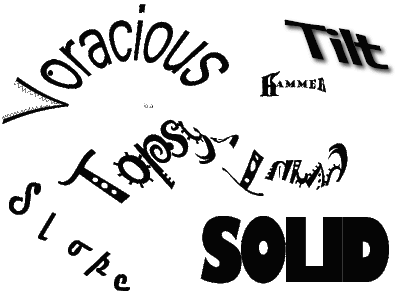
This is my revised image. I made some modification to the word Topsy-turvy as well as voracious based on feedback from my partner. Since Topsy-turvy in essence means to turn upside down, I turned the second half of my word upside down. I am not sure that this font is very conducive to this as I now feel that the word may be too hard to read. I also made some modification to the word voracious. I thickened the stroke on all the letters except the V. I felt that this helped give the letters a more weighty feel without closing them off. I wanted to maintain the open feeling of the letters as I think it helps to convey the idea of an empty vessel (or stomach).
In my last iteration I neglected to do a write-up on the word hammer so I will add it here.
hammer- In order to convey the feeling and meaning of the word hammer I used a bold serifed font in multiple sizes. The serifs helped to form the outline of the hammer and by adjusting the kerning between the H and the a (the head of the hammer and the start of the handle) the letters appear to form the general shape of the hammer. Using some basic text manipulation I transformed the letters to look like the general shape of a hammer.
I also made a short video on the making of this letter which can be seen here: http://jes-edtech506.blogspot.com/2009/07/expressive-words-making-of-hammer.html.
Expressive Words - Unit 3 Take 1
Posted in EdTech506, Unit 3, Usability on by
Text in and of itself can express a great deal about the meaning of a word. For this unit I choose to design a series of words that express their meaning. As I feel that there is a certain level universality to word meanings, I was not targeting a particular grade level. I believe that these words might be at an appropriate level for students in elementary school and beyond (please click on image for larger version).
These words take advantage of font types as well as alignment, kerning, and font size. I will go through each word individually.
iota- For this word I chose a very fine font and small text size to try and convey the words meaning of small. I also choose to use all lowercase letters to further emphasize the diminutive nature of iota.
slope- Prior to typing this word I drew and imaginary slope. This slope was then used as the baseline for my word. The font I chose was chosen because the serifs on this font give a feeling of movement or directionality that I felt enhanced the feeling of sloping downward.
solid- In order to convey the feeling and meaning of the word solid I used a bold all caps font. The kerning was adjusted between individuals letters to leave just the smallest amount of white space between the letters giving the feeling of a large solid block of letters.
tilt- In order to lend perspective to this word I used the concepts of alignment and contrast, in the form of a drop shadow, to lend some depth to this text.
topsy-turvy- I wanted to add a fun word into this mix, so I chose topsy-turvy. To convey the disorganized nature of this word I chose the font Jokerman. The random nature of this font lends a feeling of disorganization to the word.
Voracious- In order to best convey the concept of voraciousness I added a bit of decoration to an already existing font. I chose the font Microsoft Yi Baiti for this word because it had a very open V shape that lent itself well the the formation of a mouth as well as very open letterforms. I felt that all of these traits gave the font a "hungry" feeling and they lent themselves well to some very simple text decoration that help to accentuate the meaning of the word. The tilt and kerning were also adjusted in this word to improve the textual alignment.
Subscribe to:
Posts (Atom)


