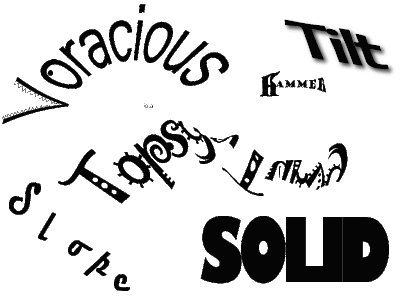
This is my revised image. I made some modification to the word Topsy-turvy as well as voracious based on feedback from my partner. Since Topsy-turvy in essence means to turn upside down, I turned the second half of my word upside down. I am not sure that this font is very conducive to this as I now feel that the word may be too hard to read. I also made some modification to the word voracious. I thickened the stroke on all the letters except the V. I felt that this helped give the letters a more weighty feel without closing them off. I wanted to maintain the open feeling of the letters as I think it helps to convey the idea of an empty vessel (or stomach).
In my last iteration I neglected to do a write-up on the word hammer so I will add it here.
hammer- In order to convey the feeling and meaning of the word hammer I used a bold serifed font in multiple sizes. The serifs helped to form the outline of the hammer and by adjusting the kerning between the H and the a (the head of the hammer and the start of the handle) the letters appear to form the general shape of the hammer. Using some basic text manipulation I transformed the letters to look like the general shape of a hammer.
I also made a short video on the making of this letter which can be seen here: http://jes-edtech506.blogspot.com/2009/07/expressive-words-making-of-hammer.html.


1 comments:
Hey there Jes,
First of all I would like to thank you for sharing your process in a cool video. I think creating the word Hammer using Adobe Illustrator is much easier than it would be in Fireworks. I am not quite sure how to go about doing that in Fireworks.
Anyway back to your project. I like the changes you have made to Voracious. The thicker letters give it a more excessive feeling yet the openness of your font keeps the empty feeling you wanted. Good job! I totally agree with you that Topsy-Turvy is difficult to read. Maybe if you changed the font it would fix this problem. I do however like the font choice as it gives it a mixed up feel. Maybe if you used two different fonts one for topsy and another one for turvy, this might help make it more legible.
I really like your project an think all of your words convey their meanings well.
Good job!
Leave a Comment