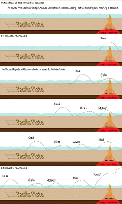
Based on comments provided by my partner I have modified the color scheme of this image to correct some issues with depth that were present in the previous iteration of the image. Both the ground and the water have been given textured fill to better illustrate their positions within the image. The font angle was also modified to bring it into the same plane as the ground in an attempt to eliminate the optical illusion that was occurring in the previous version of the image.
A this time I have elected to leave the oldest and newest labels off of the islands themselves because the image appeared cluttered with them. I will instead rely on the time period labels in the top left hand corner of the panels to establish a time line for the learner.


1 comments:
Jes on Behalf of Shannon
~~~
Hey Jess,
The changes you made were right on! This image is fantastic now in my opinion! Great work! The 3D effect is totally gone now. I also like the textures you chose the plate looks like ground. The water is a great effect and really makes things so much clearer.
Good Job!
Leave a Comment