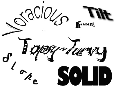
Text in and of itself can express a great deal about the meaning of a word. For this unit I choose to design a series of words that express their meaning. As I feel that there is a certain level universality to word meanings, I was not targeting a particular grade level. I believe that these words might be at an appropriate level for students in elementary school and beyond (please click on image for larger version).
These words take advantage of font types as well as alignment, kerning, and font size. I will go through each word individually.
iota- For this word I chose a very fine font and small text size to try and convey the words meaning of small. I also choose to use all lowercase letters to further emphasize the diminutive nature of iota.
slope- Prior to typing this word I drew and imaginary slope. This slope was then used as the baseline for my word. The font I chose was chosen because the serifs on this font give a feeling of movement or directionality that I felt enhanced the feeling of sloping downward.
solid- In order to convey the feeling and meaning of the word solid I used a bold all caps font. The kerning was adjusted between individuals letters to leave just the smallest amount of white space between the letters giving the feeling of a large solid block of letters.
tilt- In order to lend perspective to this word I used the concepts of alignment and contrast, in the form of a drop shadow, to lend some depth to this text.
topsy-turvy- I wanted to add a fun word into this mix, so I chose topsy-turvy. To convey the disorganized nature of this word I chose the font Jokerman. The random nature of this font lends a feeling of disorganization to the word.
Voracious- In order to best convey the concept of voraciousness I added a bit of decoration to an already existing font. I chose the font Microsoft Yi Baiti for this word because it had a very open V shape that lent itself well the the formation of a mouth as well as very open letterforms. I felt that all of these traits gave the font a "hungry" feeling and they lent themselves well to some very simple text decoration that help to accentuate the meaning of the word. The tilt and kerning were also adjusted in this word to improve the textual alignment.


1 comments:
Hey Jes,
I love your word Hammer! How did you do that! It is SO cool! I like what you have done with these words! It looks like you had fun with this one, I know I did! Anyway the only suggestion I had pertains to the word “Voracious”. First off, let me say that I like how it looks like an animal looking ravenous ready to eat. Great Job! The only suggestion I have is that the thinness of the font takes away the excessiveness that the words meaning implies. Maybe a thicker bolder font in the rest of the word would make it look more voracious. I do like the V you chose and the teeth you added. So if you kept the V and then made the rest of the word thicker I think it would convey the meaning a bit better. Of course this is just a suggestion as I think you did a great job! One more suggestion would be to turn the word Turvy upside down. This would add to the meaning I think.
Overall a fantastic job!
Leave a Comment