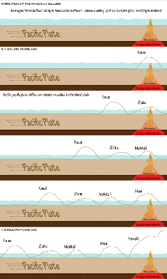
The ability to organize content in a way that reduces a student's extraneous load is a very important skill for an instructional designer (p. 123). For this unit I chose to do the Hawaiian Island challenge activity. This was quite a challenge for me as I have very little background in geology/ earth science. The graphic I designed was targeted towards students taking an introductory earth science course. These students are typically at late middle school to early high-school age.
I choose to organise my graphic in a western comic book style (p. 121). In western cultures comic books are read top left to bottom right and time is taken to progress in a top to bottom fashion (i.e. things at the top of the page happen temporally before things at the bottom of the page). The islands are depicted as moving right to left because this is a realistic depiction of the direction of motion of the pacific plate (east to west).
I wanted to give the learner a pathway through the formation of the Hawaiian islands (p. 122). The graphic depicting change over time leads the learner through the learner through the process and helps to depict the process in easy to understand chunks (p. 125). All information is organized on the horizontal plane (p. 128) and related items are located in close proximity to one another (P. 133). Text was used in places where the learner may benefit from additional explanation and in all cases where numbers were used approximations were given because detail was not necessary (p. 139).


0 comments:
Leave a Comment