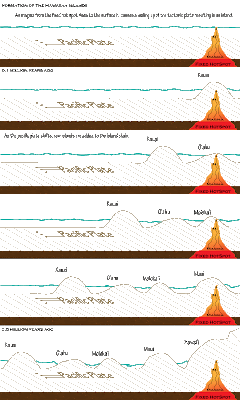
The ability to organize content in a way that reduces a student's extraneous load is a very important skill for an instructional designer (p. 123). For this unit I chose to do the Hawaiian Island challenge activity. This was quite a challenge for me as I have very little background in geology/ earth science. The graphic I designed was targeted towards students taking an introductory earth science course. These students are typically at late middle school to early high-school age.
I choose to organise my graphic in a western comic book style (p. 121). In western cultures comic books are read top left to bottom right and time is taken to progress in a top to bottom fashion (i.e. things at the top of the page happen temporally before things at the bottom of the page). The islands are depicted as moving right to left because this is a realistic depiction of the direction of motion of the pacific plate (east to west).
I wanted to give the learner a pathway through the formation of the Hawaiian islands (p. 122). The graphic depicting change over time leads the learner through the learner through the process and helps to depict the process in easy to understand chunks (p. 125). All information is organized on the horizontal plane (p. 128) and related items are located in close proximity to one another (P. 133). Text was used in places where the learner may benefit from additional explanation and in all cases where numbers were used approximations were given because detail was not necessary (p. 139).


1 comments:
Jes on behalf of Shannon
*Unit 5 comments*
I like this image! I think that it is very clear. I had to take one geology course when I was at UH and we actually got to go to the Big Island (Hawaii) and collect lava samples, see lava tubes and lots more, it was a great trip! I don’t remember much from that class but I do remember the stuff about how the islands are forming. To me, your image depicts this process quite well!
I like how you made your hot spot look hot by your choice of colors. And I like the thick brown line at the bottom.
I think the line fill in your island formations and on the Pacific Plate add some confusion. It creates a sort of 3D effect making it look as though the land is behind the magma. The words “Pacific Plate” also seem to be lying down on this flat land that is behind the magma. I would suggest changing your fill to a solid color this should be a lighter color as this might depict a higher level of the Earth’s crust.
The water might look a bit better if it was colored as well. I was thinking making everything under water look under water by adding a transparent blue shape on top of the bits under water. (but this is merely a suggestion as it looks fine as it is).
I think their might need to be labels above Kauai stating that it is the oldest island and above Hawaii stating that it is the youngest.
Other than those few suggestions I think you did a fantastic job at this.
Leave a Comment