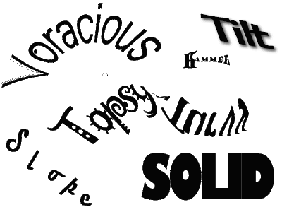
The suggestion fo using two fonts was fantactic! Here is my revised image. I chose to keep Jokerman as the font for 'Topsy~' but changed the font for Turvy to a non-serifed rounded font called Hobo. I think this font still has a fun feel to it but the change increases the legibility of the word overall.
Expressive Words - Unit 3 Take 3
Posted in EdTech506, Unit 3, Usability on 2:40 PM by Jes CaronThe suggestion fo using two fonts was fantactic! Here is my revised image. I chose to keep Jokerman as the font for 'Topsy~' but changed the font for Turvy to a non-serifed rounded font called Hobo. I think this font still has a fun feel to it but the change increases the legibility of the word overall.
Subscribe to:
Post Comments (Atom)
1 comments:
Hey Jes,
It looks way better. I am gld the two font thing worked out!
Shannon
Leave a Comment