Final Project

Our final project for EdTech506 asked us to collect images that exemplifed the ten tips for images and photographs presented by Dr. Linda Lohr in her book, Creating Graphics for Learning and Performance. For this project I assembled a PDF portfolio of some of my photography. The PDF portfolio can be viewed here: http://edtech2.boisestate.edu/caronj/506/Images.pdf.


Organization - Unit 5 Final Take


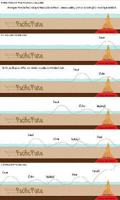
The ability to organize content in a way that reduces a student's extraneous load is a very important skill for an instructional designer (p. 123). For this unit I chose to do the Hawaiian Island challenge activity. This was quite a challenge for me as I have very little background in geology/ earth science. The graphic I designed was targeted towards students taking an introductory earth science course. These students are typically at late middle school to early high-school age.

I choose to organise my graphic in a western comic book style (p. 121). In western cultures comic books are read top left to bottom right and time is taken to progress in a top to bottom fashion (i.e. things at the top of the page happen temporally before things at the bottom of the page). The islands are depicted as moving right to left because this is a realistic depiction of the direction of motion of the pacific plate (east to west).

I wanted to give the learner a pathway through the formation of the Hawaiian islands (p. 122). The graphic depicting change over time leads the learner through the learner through the process and helps to depict the process in easy to understand chunks (p. 125). All information is organized on the horizontal plane (p. 128) and related items are located in close proximity to one another (P. 133). Text was used in places where the learner may benefit from additional explanation and in all cases where numbers were used approximations were given because detail was not necessary (p. 139).

Organization - Unit 5 Take 2


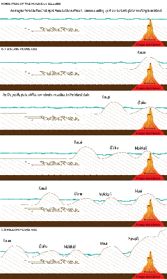
Based on comments provided by my partner I have modified the color scheme of this image to correct some issues with depth that were present in the previous iteration of the image. Both the ground and the water have been given textured fill to better illustrate their positions within the image. The font angle was also modified to bring it into the same plane as the ground in an attempt to eliminate the optical illusion that was occurring in the previous version of the image.

A this time I have elected to leave the oldest and newest labels off of the islands themselves because the image appeared cluttered with them. I will instead rely on the time period labels in the top left hand corner of the panels to establish a time line for the learner.

Unit 5 - Discussion of Wordle

My Masters of Science in Biotechnology focused on the interactions of over the counter phytoestrogens on breast cancer cells. For this activity I choose to create a Wordle diagram of my thesis, "Comparisons of the effects of an OTC phytoestrogen extract (Promensil) and 17ß-estradiol on the proliferation of MCF7 cells, a neoplastic breast epithelial cell line." I chose this topic because I felt that I had a very good grasp on the hierarchical nature of this text. I choose to do two different Wordle diagrams: one of the entire document and then a separate one encompassing only the results and conclusions sections of my thesis. I constructed these two diagrams because I felt that it would be interesting to compare the overall document to the results.

Thesis in a Cloud


My first Wordle diagram was constructed based on my complete thesis. I was at first struck by what an amazing job this site did at reducing my over 50 page document to just a (relatively few words). The software seems to work on a frequency algorithm that discounts common English words (e.g. the word 'the'). I think frequency does a decent job at picking out the important words in a document, however frequency means that unimportant but highly used can appear in the Wordle in a way that makes them appear more important than they are. In my Wordle the Latin abbreviation et al appeared in fairly large font because many of my references had multiple authors. Et al was clearly not a focus in my paper and therefor I would rank this as a aberration in the hierarchy. However overall I think Wordle did a really good job! My thesis focused on the effects of Prominsil extract on MCF-7 cells. The main active component in Prominsil is the Phytoestrogen genistein which binds to the estrogen receptor and mimics 17ß-estradiol the predominate form of estrogen in the body. The bold words above correspond to the largest words in the Wordle.

Thesis Results in a Cloud


As an experiment I created a second Wordle using only the results and conclusions sections of my thesis. I feel that the results in this Wordle are a bit more accurate which may be attributed to the smaller amount of more focused text that was fed into the software.

~~~

I am including the abstract from my thesis below in case anyone is interested :)

Due to the serious risks associated with estrogen therapy following menopause many women are turning to a natural alternative, phytoestrogens. Phytoestrogens are plant derived compounds which induce estrogenic response in humans. Estrogenic response is produced by phytoestrogens interacting directly with the estrogen receptor. The estrogen receptor is a steroid receptor belonging to the nuclear receptor family, which has high affinity for both its native ligand 17β-estradiol and phytoestrogens.

Many women seeking to avoid the drawbacks of estrogen therapy opt to “safely and naturally” relieve menopausal symptoms with over the counter phytoestrogen supplements. While anecdotal evidence suggests phytoestrogen supplements do indeed provide menopausal relief the true risk to the individual has yet to be assessed. The goal of this project was to assess the effects of an OTC phytoestrogen supplement, Promensil®, on the proliferation of an ER positive neoplastic breast epithelial cell line, MCF-7.

Exposure to 100% Promensil® extract caused a marked decrease in cell growth relative to control over all assay systems used; MTT, tritiated thymidine uptake, and PCNA immunoblotting. Reduction in cellular growth was accompanied by an upregulation in the caspase pathway, as evidenced by the presence of procaspase-3 banding in phytoestrogen treated cells. While further investigation is warranted, a reduction in the growth of ER positive neoplastic breast epithelial cells through the use of phytoestrogens could prove to have real life clinical implications. Defined phytoestrogen mixtures may prove to be potential drug candidates for the prophylactic treatment of women at high risk for breast cancer.

Organization - Unit 5 Take 1


The ability to organize content in a way that reduces a student's extraneous load is a very important skill for an instructional designer (p. 123). For this unit I chose to do the Hawaiian Island challenge activity. This was quite a challenge for me as I have very little background in geology/ earth science. The graphic I designed was targeted towards students taking an introductory earth science course. These students are typically at late middle school to early high-school age.

I choose to organise my graphic in a western comic book style (p. 121). In western cultures comic books are read top left to bottom right and time is taken to progress in a top to bottom fashion (i.e. things at the top of the page happen temporally before things at the bottom of the page). The islands are depicted as moving right to left because this is a realistic depiction of the direction of motion of the pacific plate (east to west).

I wanted to give the learner a pathway through the formation of the Hawaiian islands (p. 122). The graphic depicting change over time leads the learner through the learner through the process and helps to depict the process in easy to understand chunks (p. 125). All information is organized on the horizontal plane (p. 128) and related items are located in close proximity to one another (P. 133). Text was used in places where the learner may benefit from additional explanation and in all cases where numbers were used approximations were given because detail was not necessary (p. 139).

Color and Depth - Unit 4 Final Take

There are several graphical tools at the disposal of the Instructional Designer to aid in capturing or maintaining the attention of the learner. Tools such as color, depth, and space can all aid in the design of an effective visual (p. 265). For this unit I choose to explore these tools using a basic image of a snail. I was not targeting a particular grade level for this exercise rather I chose to explore the tools in a basic manner that is content and grade level independent. Please click on the image for a larger more detailed version.

Starting from the base of a simple shape (p. 254) I created the outline of a snail. From there I explored the use of texture (p. 272), full color (Ch. 11), and depth or dimension (p. 270). Each of these tools had a different effect on my perception of the snail image. The addition of a colored texture to the snail shell called my attention to the shell and also lent it a more three dimensional feel. The texture helped the shell to not appear as flat as it does in the other drawings where only color is used. The use of full color on the third snail helped to draw my attention to the snail and aids in aesthetic appeal (p. 265), however, as is mentioned in the text book color in this situation was not required. In this case color was used to create a visual appeal that calls the viewers attention to the image and aides in selection (p. 266 and 267). Lastly, drop shadow was used to give the snail dimension and the appearance of three dimensionality (p. 272). The addition of the drop shadow give the snail the feeling of depth as well as orientation.

Figure-ground, appropriate use of white space, and scale also factored into the creation of this image. The snails were designed to not result in optical illusion or other confusing visual effects thereby avoiding a figure ground conflict (p. 107 and 108). The snails were all placed in the same plane relative to the ground enhancing the feeling that the snail is moving forward along the ground. This placement also limits issues with figure ground that may have resulted from varying the orientation of the snail relative to the ground. White space was also used in this figure as well as scale. By using a large heading text and a relatively small amount of white space above the snails a sense of scale is conveyed to the viewer (p. 272). I used both of these tactics to convey the smallness of the snails. themselves.

The color scheme chosen for this diagram was inspired by nature (p. 269). As the subject of this diagram was snails I felt that a nature/spring theme was very appropriate for the visual.


Color and Depth - Unit 4 Take 2

Based on comments provided by my partner I have modified the positions of the snails to place them all in the same plane relative to the ground. Placing all the snails in front of the ground enhances the feeling that the snail is moving forward along the ground. It also limits issues with figure ground that may have resulted from the previous orientation of the snails. It was also suggested that a bit of bevel be added to the last snail which is a suggestion that I like a lot, however due to the way my figure was drawn the addition of a bevel in Illustrator does not appear to be possible.


Back to Home Back to Top Multimedia Learning. Theme ligneous by pure-essence.net. Bloggerized by Chica Blogger.